Case · 05 · Landing · Children's home

A landing that turns scroll into donations.

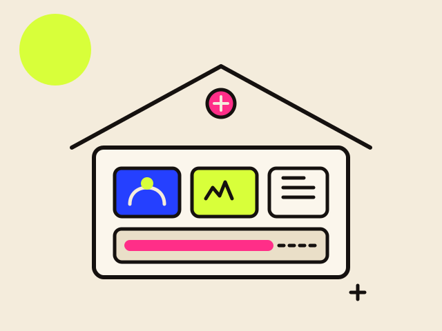
A page made for a children's home with no way to attract donations organically — where every photo and story brings the children closer to whoever can help.

Client
Children's home · Coacalco
Role
Branding · UX/UI Designer
Type
Social project
Deliverables
Logo, landing, photography

01 · Overview

A cause with no way to attract donations.

This wasn't a normal assignment: there was no company client behind it. The platform was created for a children's home that had no way to attract donations organically.

The goal was to give it its own digital presence — a landing that tells who the children are, what they do, and how financial support changes their day to day.

02 · Challenge

How do you tell a story that moves people to donate?

There were several challenges. The first, a logo that spoke about the home, the children, and their time there, but that the public would recognize without having to visit the site or social media.

The second, to show through photography children who want a healthy, happy childhood, with the tools to reach their dreams — without falling into pity.

The call I made

A donation is not a purchase. Nobody arrives ready to give — they arrive curious, and something has to carry them from curiosity to a decision that costs them money and gets them nothing back.

So I decided not to design "a landing page" but a sequence. Every section had to earn the next scroll, and each design choice had to answer which stage of that sequence it served.

03 · Process

Brand, photography, and real stories.

Stage 01

Awareness

A logo that says children and home on its own, so the cause is recognisable outside the site and its social media.

Stage 02

Trust

Real photography instead of stock: this is a place that exists, with children who are actually there.

Stage 03

Understanding

Physical, psychological and educational wellbeing, so support is a concrete thing and not a vague good deed.

Stage 04

Intent

Biographies with names and activities — the moment the visitor stops reading about a cause and starts thinking about a person.

Stage 05

Donation

A clear path to give, placed after the story rather than competing with it for attention.

The heart of the project was building a library of photographs and biographies of the children: their activities, their intellectual and emotional development, and how financial support walks alongside them.

  1. Identity of the home

    A logo that communicates children and home, recognizable on its own without relying on the website or social media.

  2. Photography direction

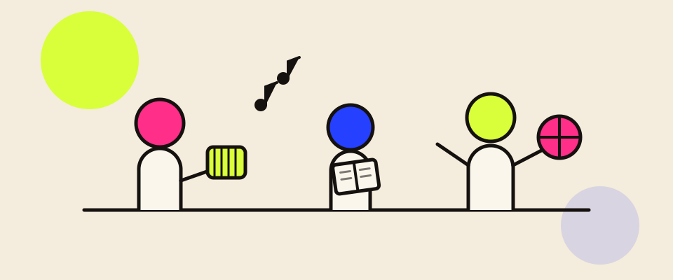
    Images of a healthy, happy childhood: music, play, study — the children as protagonists, not as victims.

  3. Library of biographies

    Stories of each child: activities, intellectual and emotional development inside the home.

  4. Landing structure

    A scroll that goes from getting to know the home, to meeting the children, to getting involved and donating.

  5. UI & call to donate

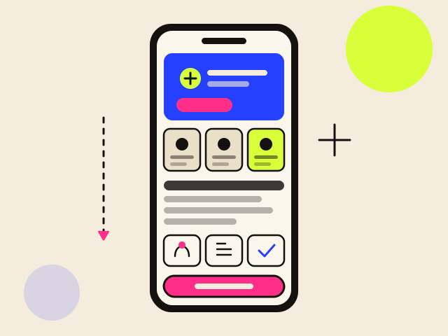
    Sections on physical, psychological, and educational wellbeing, with a clear path toward donating.
04 · Solution

Every story is a reason to help.

The landing puts the children at the center: warm photography, real biographies, and clear sections on physical, psychological, and educational wellbeing. The donation stops being abstract and becomes something concrete that supports someone with a name and a story.

Decision · 01

Recognizable logo

A brand that speaks of children and home, identifiable without needing to visit the site or social media.

Decision · 02

Photography with dignity

Happy, active children as protagonists, showing potential instead of pity.

Decision · 03

Stories that connect

Real biographies that turn the donation into concrete support for a real child.

The hardest call in the whole project.

What we chose

Dignity over urgency

Happy, active children shown as protagonists. It builds a cause people want to be part of — and it is what the home asked for and what the children deserve.

What we knowingly gave up

The short-term conversion lever

Imagery of hardship reliably raises immediate giving. I recommended against it: a donor recruited by guilt gives once, and the cost is paid by children who are shown at their worst to strangers.

The call I made

Placing the donation call after the biographies, not in the hero, was the decision I had to defend hardest. Every conversion instinct says put the ask where the eye lands first.

But the funnel said the opposite: at the top of the page a visitor has no reason to give yet. Asking early converts the small group who already decided and spends the attention of everyone else. I chose to build intent first and ask once, from a position where the answer means something.

05 · Outcome

A cause with a voice of its own.

1

Brand identity

A logo of its own that the home can use on and off the site.

3

Wellbeing pillars

Physical, psychological, and educational, told through the children.

5stages

A designed sequence

From awareness to donation, with every section answering to the stage it serves.

What is measured here. This is a social project without an analytics budget, so there are no conversion figures. What the home gained is a channel it did not have before: a first organic route to donations, and a photography and biography library it can keep growing on its own. The next thing worth measuring is simple — how far down the page people get before they leave.

What I take away from this project

Curious about my work?

Let's chat. I'm always open to understanding a project better, no matter how challenging or complex it seems.

Let's talk →