Brand, identity, and a design system for a payment gateway that connects merchants and buyers — built to inspire the same trust as a bank.
01 · Overview
Vlum is a payment gateway: the intermediary that lets you collect payments through multiple electronic methods. Like point-of-sale tools such as Clip or Mercado Pago, or the platforms behind Uber, online courses, and subscriptions that rely on a gateway to generate the purchase ticket and the deposit to the merchant.
Beyond moving money, a gateway validates fraud and laundering. This project stayed on the drawing board, but it gave me a deep understanding of how payment-intermediary processes work.
02 · Challenge
The biggest challenge was understanding the companies that already exist and, above all, their validation: the backing of their clients and users' trust to deposit — often in foreign currency, due to restrictions that sometimes exist.
Moving other people's money requires that people believe in the platform before they use it.
The client asked for a gateway. There was no product, no users, no data — only an ambition to enter a market already held by Conekta, Stripe and OpenPay. In that situation the risk is designing a competitor's product with a different logo.
I decided to treat the whole engagement as a bet that had to be argued, not a brief to execute: state the assumption, find evidence for or against it, and only then design. What follows is that chain.
I don't associate payment gateways with payments, but I trust the product, so I take the risk.
Testimonial · ResearchI don't know the processes between the payment and how my bank asks me to authorize the charge.
Testimonial · ResearchMost of my payments are set up on autopay, and I didn't know payment gateways as an intermediary.
Testimonial · Research03 · Process
All the ideation, the benchmark, and the creation of brand and identity were made to present a solid proposal to the client, who wanted to understand the process and step into the world of payment gateways.
Assumption
The client's premise: win the merchant, and the buyer follows. Trust was framed as a B2B sales problem.
Evidence
Benchmark of Conekta, Stripe, OpenPay and PayU across their customer journey, against conversations with a small-business CEO, a tech entrepreneur and a freelance consultant.
Insight
People described paying through an intermediary they could not name, and deciding to proceed based on whether the moment felt like their bank. The trust problem was on the buyer side, not the merchant side.
Opportunity
If people already map this moment onto their bank, the fastest route to trust is to speak that visual and verbal language deliberately — not to invent a new category.
Decision
I argued the first deliverable should be identity and design system, not screens. Without a credible surface, no flow we designed would get used — and the client needed something they could take to a board, not a prototype.
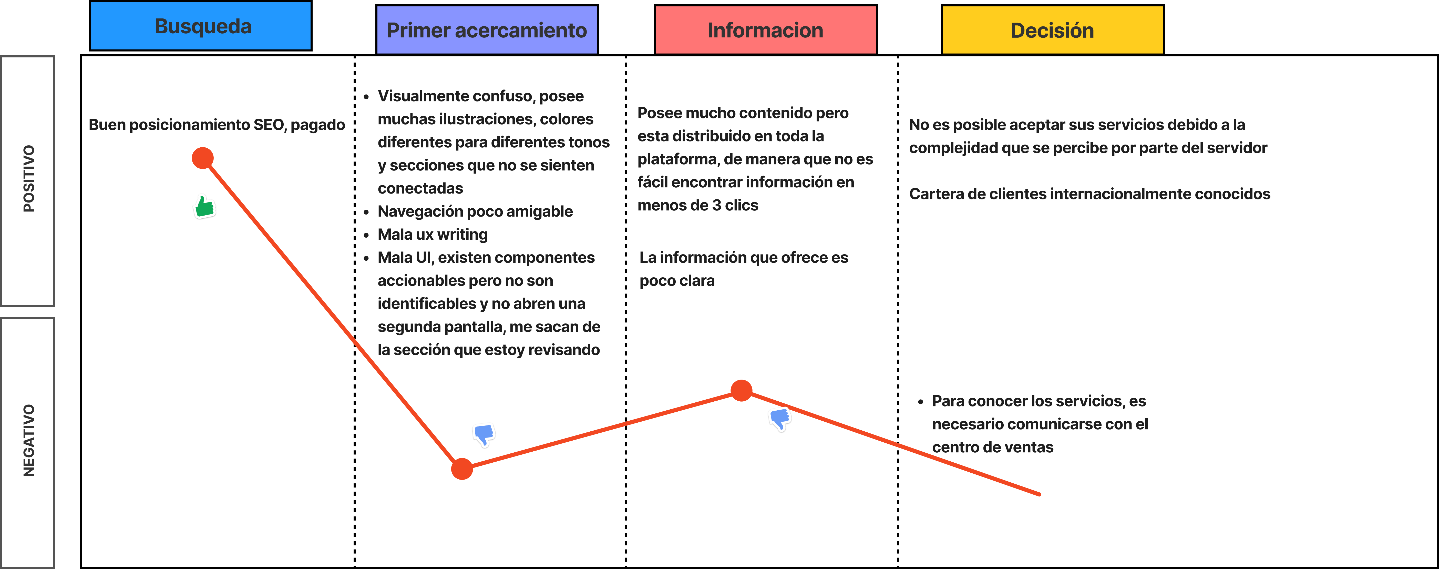
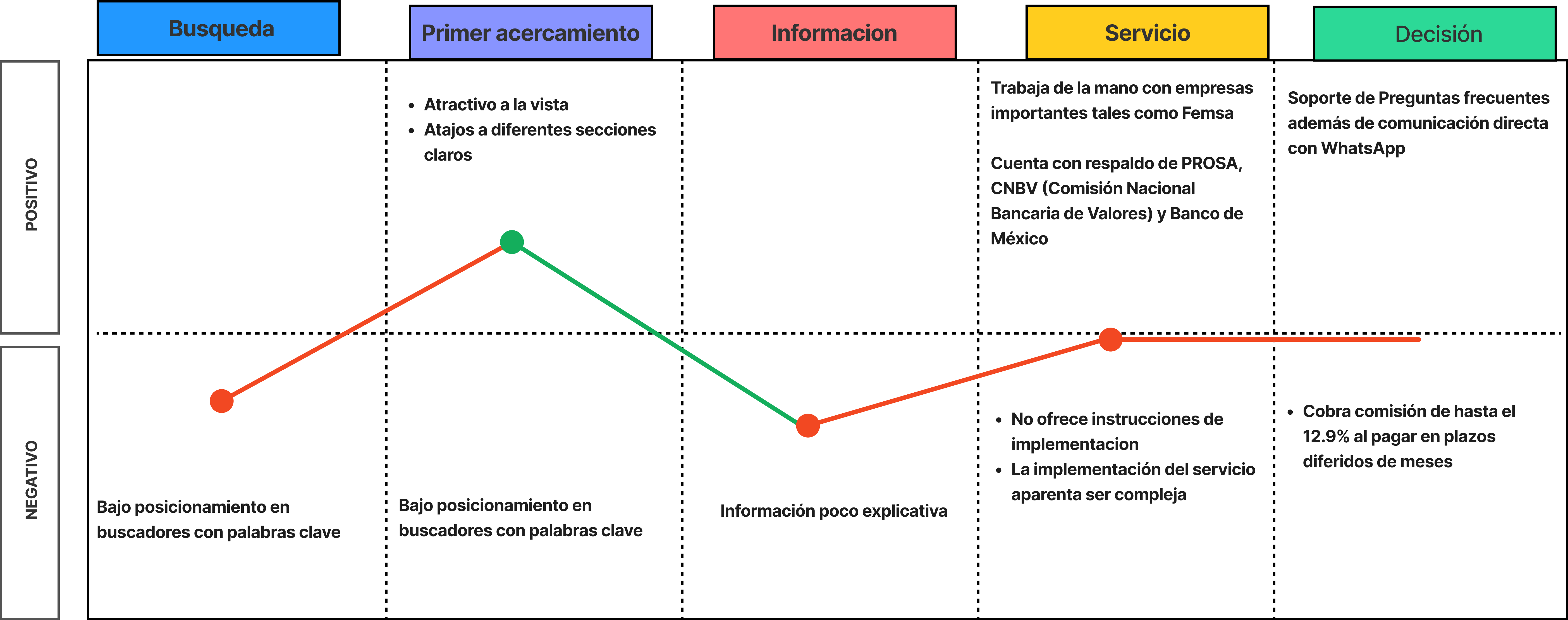
Analysis of existing gateways —Conekta, Stripe, OpenPay, PayU— mapping their customer journey: search, first contact, information, service, and decision.
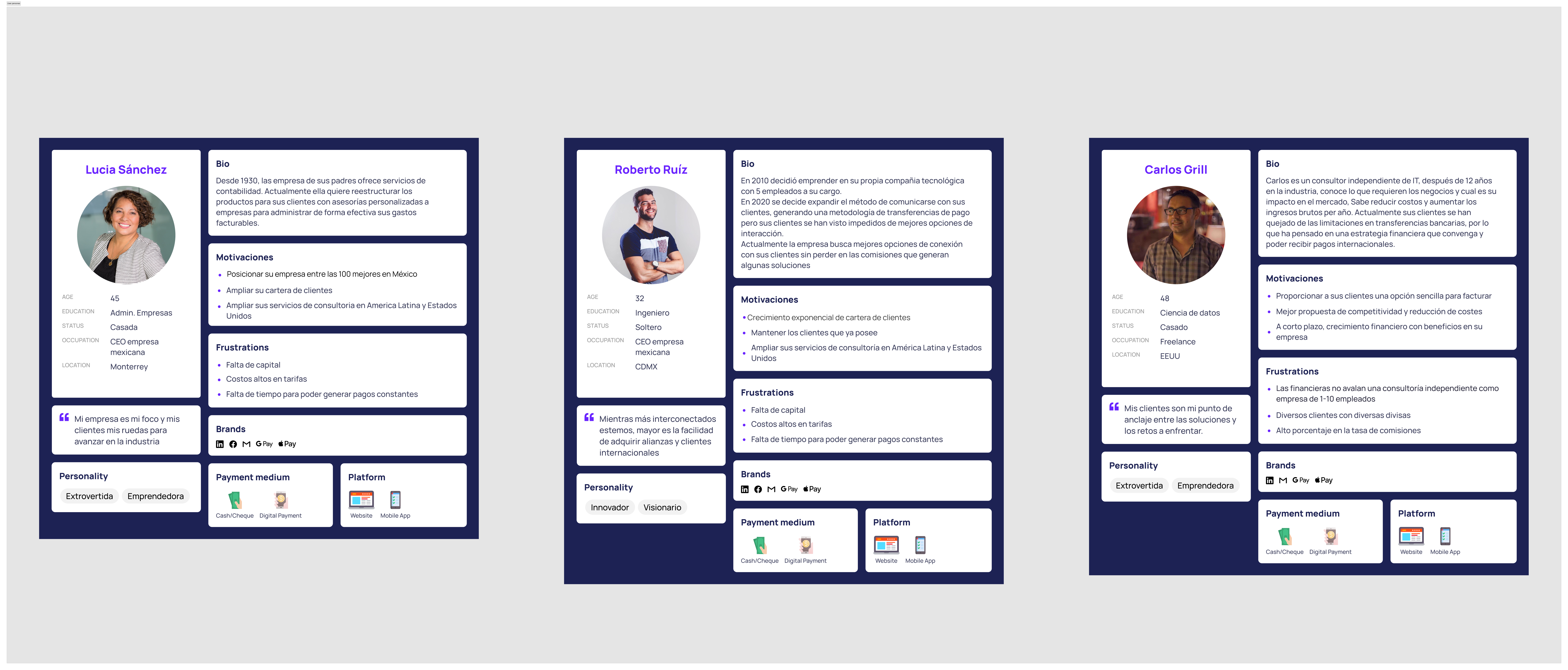
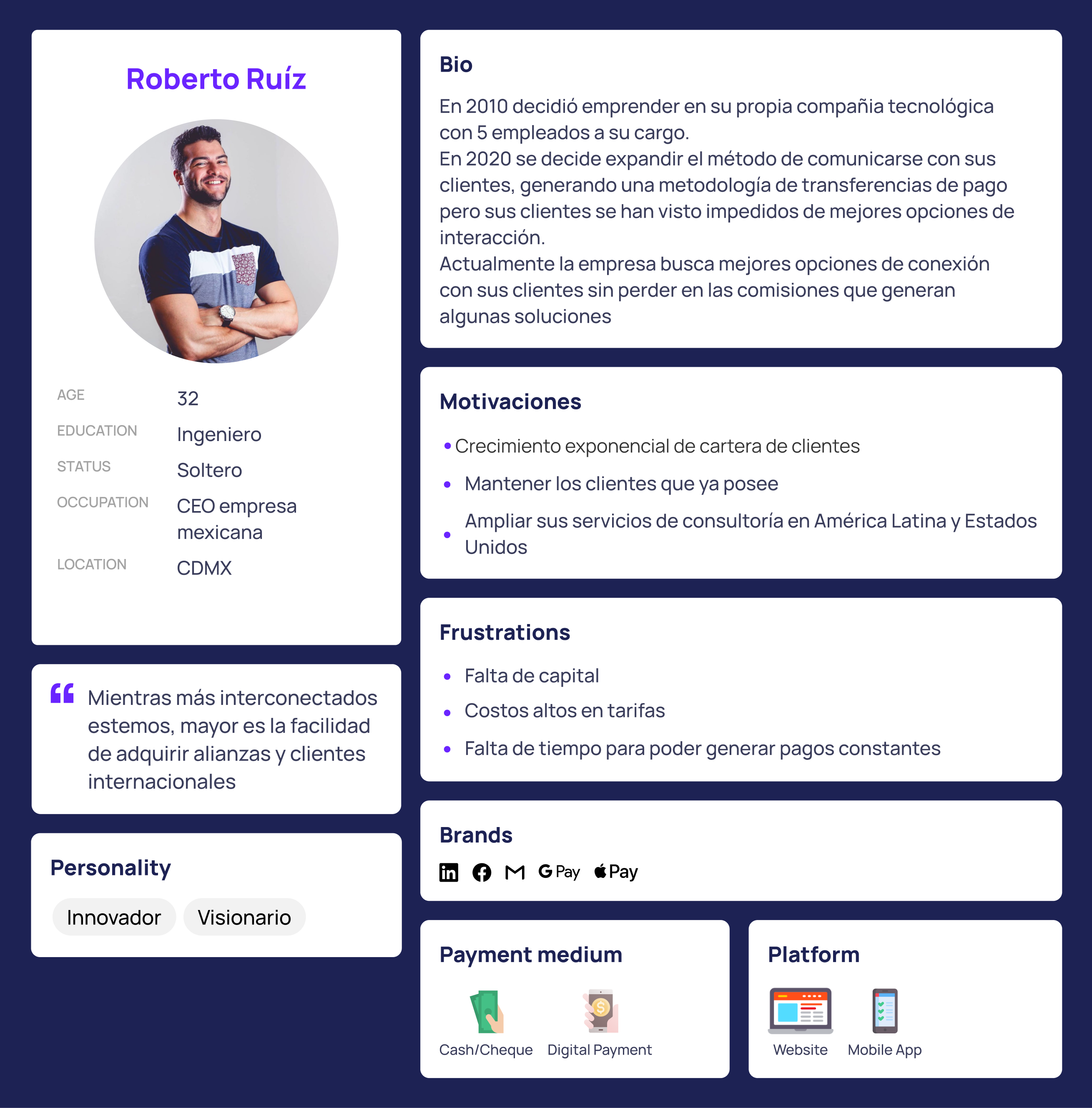
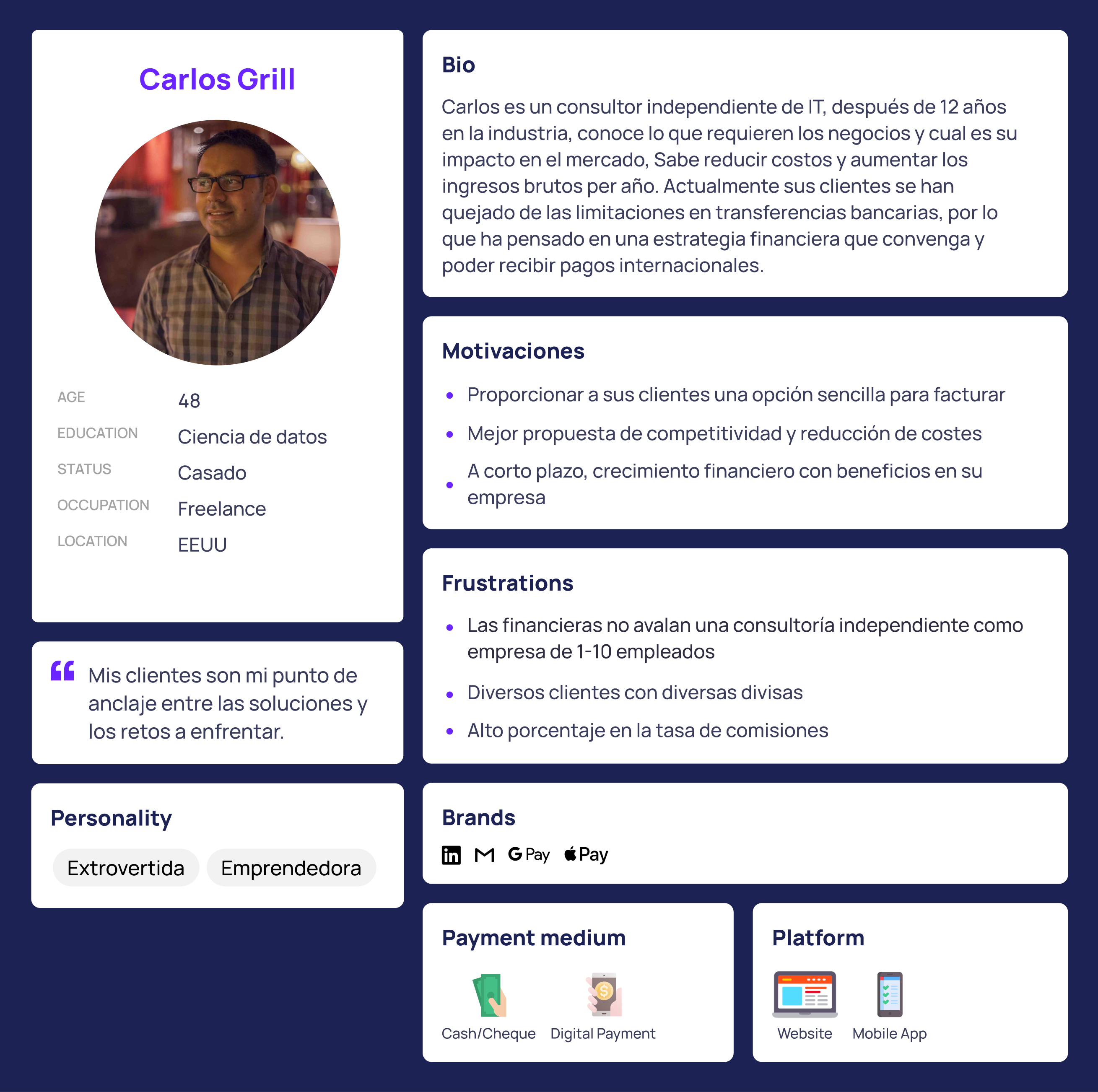
Three real market profiles: a small-business CEO, a tech entrepreneur, and a freelance consultant, each with their own payment motivations and frustrations.
Vlum's ideal journey against the pain points spotted in the competition.
Naming, logo, palette, and voice: a brand that feels close to banking without being a bank.
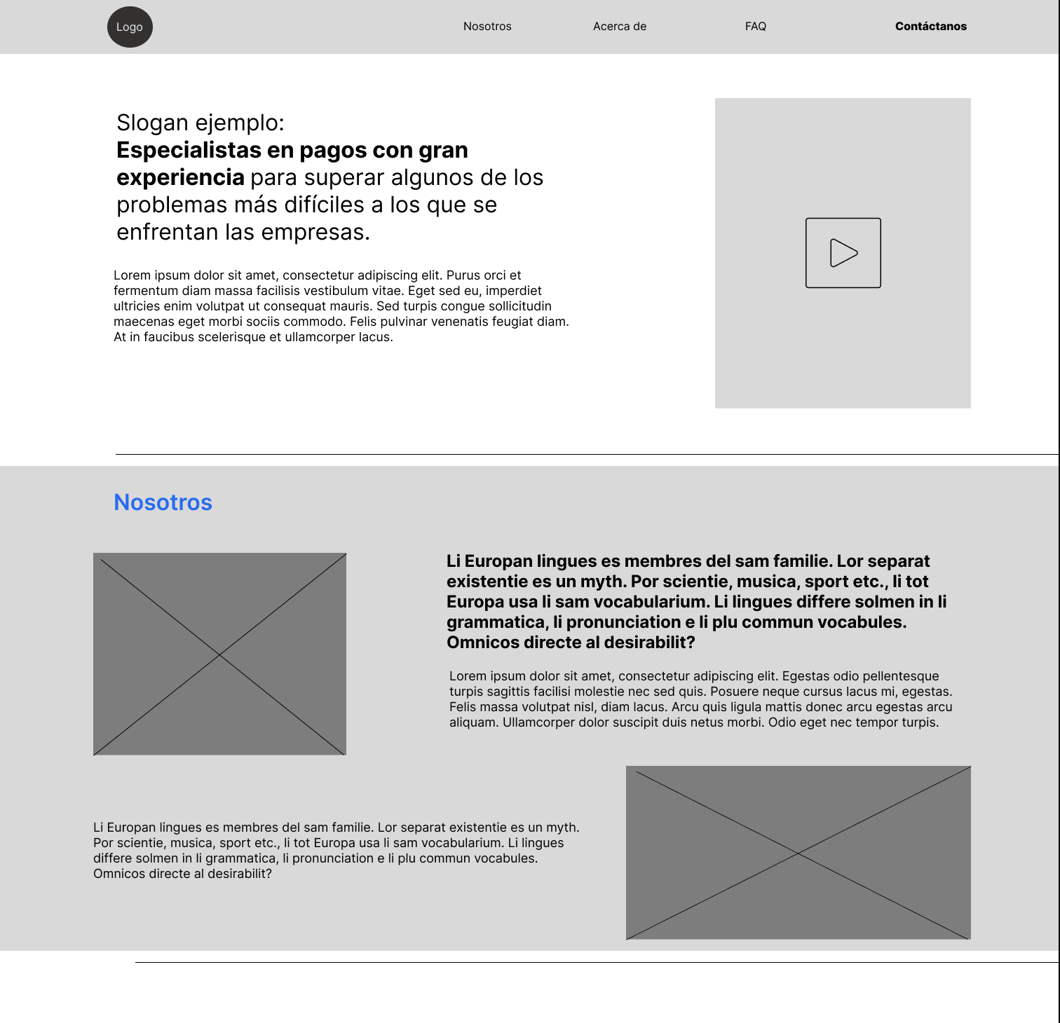
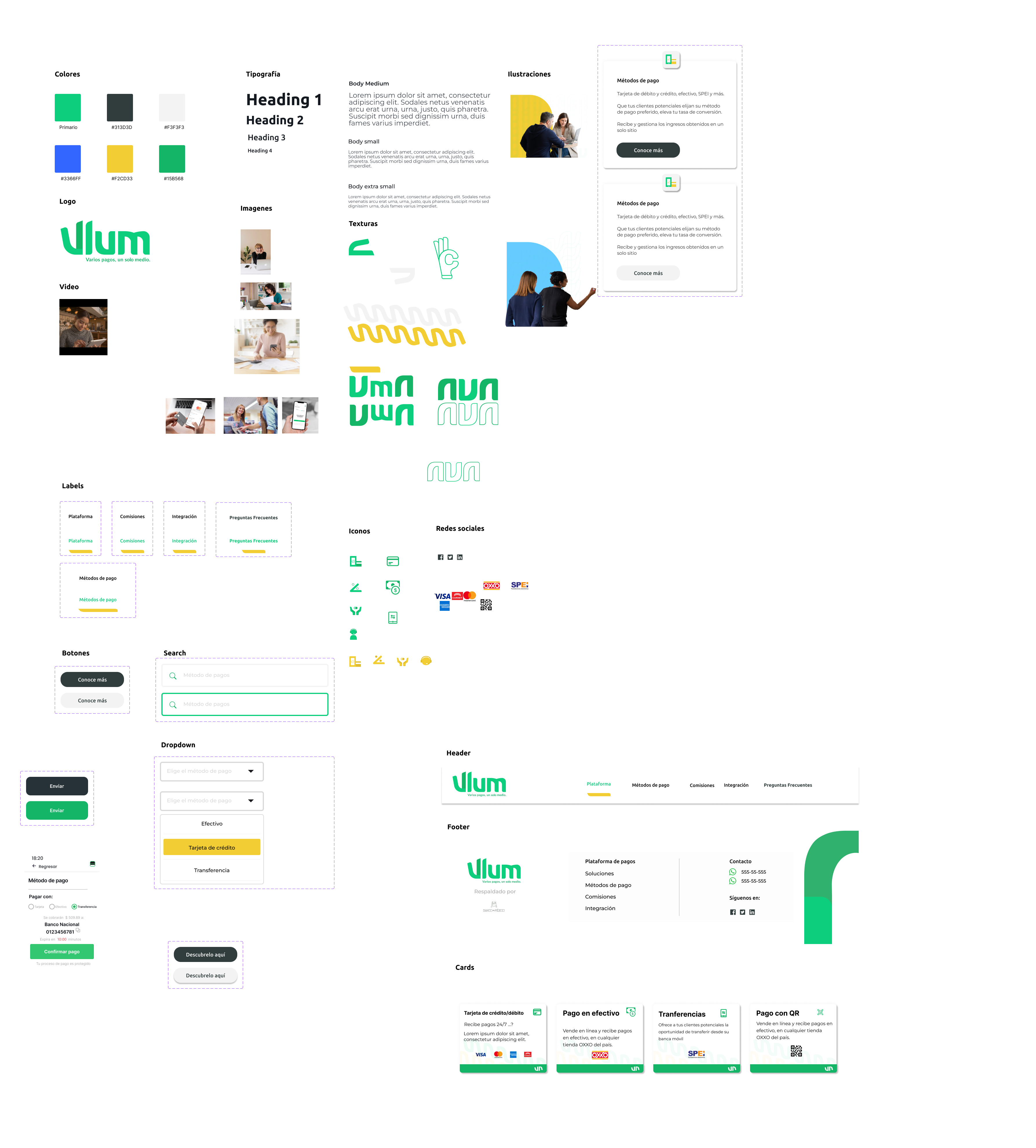
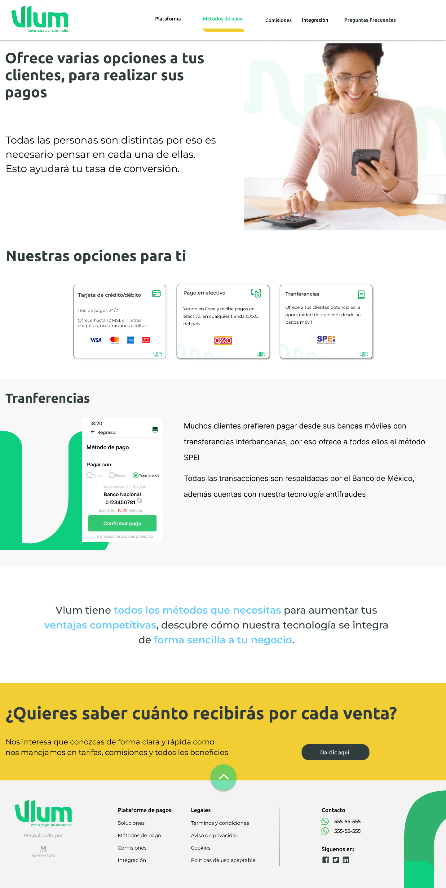
A complete design system and a landing that lands the value proposition.
Benchmark · Conekta
Benchmark · Stripe
Customer journey · Vlum
Small business
Entrepreneur
Freelance04 · Solution
The solution was to lean on what people already associate with safety: banking colors, terminology that matches a bank's —even though Vlum isn't one— and graphics tied to finance. If people associate them with a bank, the brand had to speak that language.
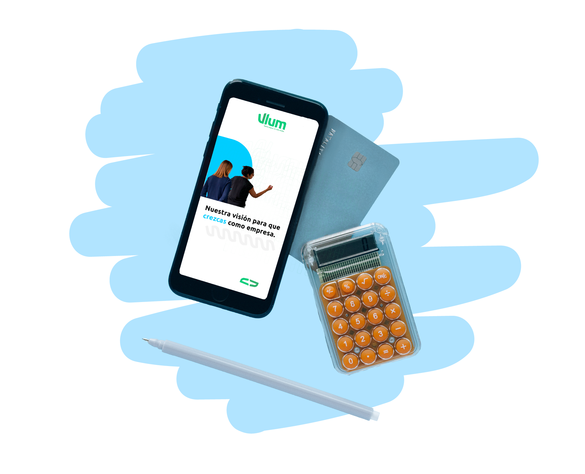
Brand · Vlum
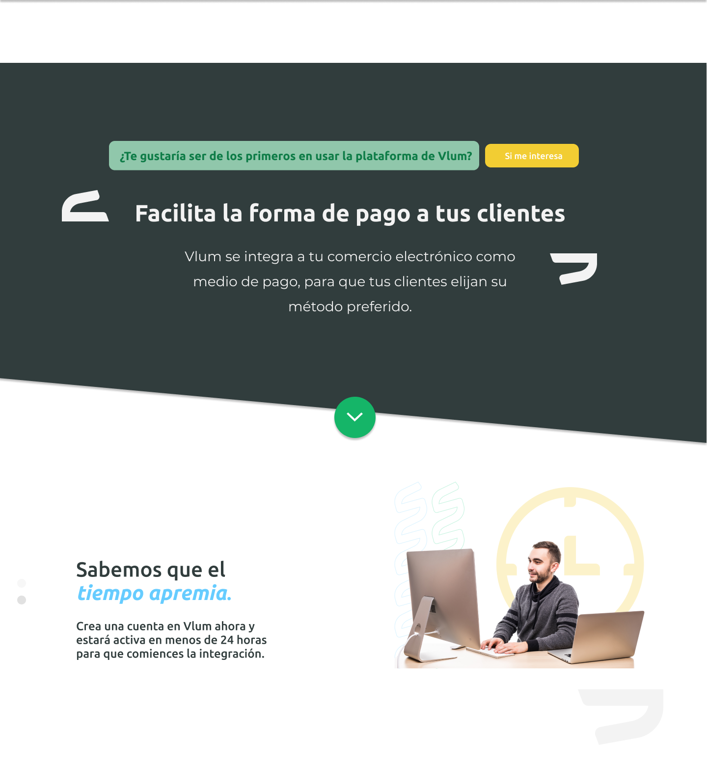
Landing · Hero
Full design system
Landing · Payment methodsA palette people link to financial institutions, to inherit that perception of safety.
Language that matches banking, even though Vlum is a gateway and not a bank.
Iconography and illustration tied to financial themes to reinforce the context.
What we gained
Banking colours and terminology let a brand nobody had heard of read as safe on first contact — the single biggest barrier for a product that moves other people's money.
What we gave up
Looking like a bank means looking like the other gateways too. I accepted a less ownable identity because, at zero users, being trusted matters more than being remembered — and differentiation can be earned later, from a position of credibility.
05 · Outcome
4
Gateways analyzed
Benchmark of Conekta, Stripe, OpenPay, and PayU with their customer journey.
3
User personas
Small business, entrepreneur, and freelancer, with real motivations and frustrations.
0users
Never shipped
The proposal did not go to production, so nothing here is validated by real behaviour — only by research and argument.
What this case does and does not prove. Evidence comes from a competitive benchmark of four gateways and qualitative conversations with three market profiles. There are no adoption, conversion or revenue figures, because the product never reached production. What it demonstrates is how I make a decision when there is no data to lean on — and what I would have measured first had it shipped: whether buyers who could not name the gateway still completed the payment.
Let's chat. I'm always open to understanding a project better, no matter how challenging or complex it seems.