How we turned a 48-hour bottleneck in credit origination into a check that takes less than 2 minutes and the business, technical, and human decisions that held that change together.
View the presentation01 · Overview
The company's core product is credit origination. To move forward, the team had to pull a credit-bureau report — and that report took
48 hours per person to come back.
That gap left the customer with no clarity: no amount limits, no risk level, no way to know whether they already had an active loan. It opened the door to over-indebtedness and default, and it left the sales team talking without data in front of them.
02 · Method
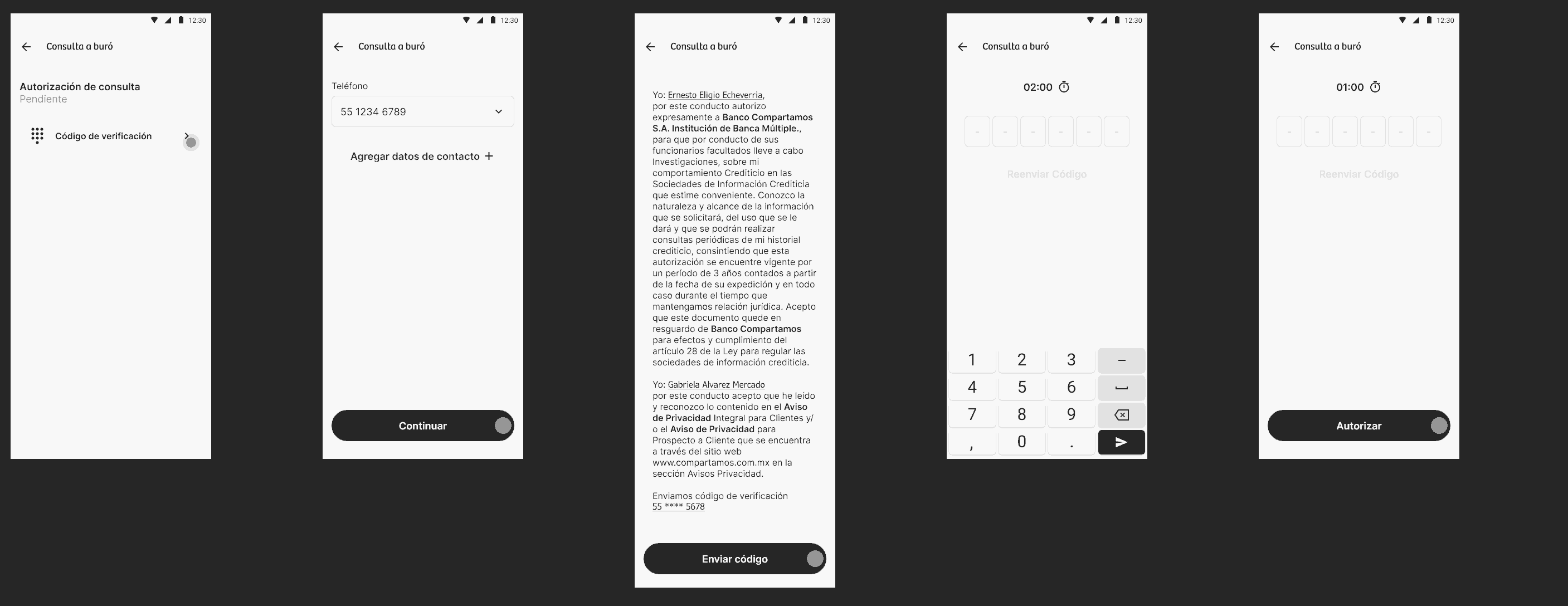
We started with Design Thinking because the problem wasn't defined yet. It gave us room to explore without committing development resources too early. Once the solution hypothesis was validated — OTP over WhatsApp, with a clear acceptance flow — the project changed nature, and we moved to Scrum to manage delivery.
Phase 01
Phase 02
I proposed the methodology switch at the exact moment of transition — it wasn't an established company process. I saw that staying in exploratory mode after the hypothesis was validated would have delayed delivery, and that forcing Scrum from day one would have closed the discovery space the problem still needed.
03 · Challenge
We framed the challenge like this: how do we give an immediate, trustworthy answer in front of the customer without losing the legal and risk rigor a bureau check demands?
We took that need to five teams working in parallel — each one carrying a different constraint.
They needed to keep the conversation alive, not send the customer home for two days.
An authentication method people already recognize and don't have to be taught.
Identity had to hold up: fraud prevention and money-laundering rules were not negotiable.
Limited resources, and room to test before committing to a channel.
Keeping the four forces coherent so no single incentive decided for the rest.
I decided not to let Sales' urgency set the direction of the solution before we had preliminary validation from Legal and Tech.
04 · Process
To validate trust in the new flow, I designed a comparative qualitative study. Asking someone whether they trust a digital checkbox isn't enough — they had to live it against their own previous experience. So the sample was customers who already held a loan, but had signed for it on paper. That gave us a direct physical-vs-digital comparison with the same person as the reference point for both worlds.
The session was structured as a journey, not a survey: the person's full path from being asked for authorization to receiving the answer. And it ran on real navigation through the prototype — the user had to find and read the push notification and capture the verification code as they would in real life. The process wasn't described to them; they navigated it.
Moderated comparative journey, qualitative, run on a navigable prototype — including the simulated push notification and a working code-capture field.
Figma prototypeCustomers who had already taken out a loan, signed on paper.
They were the only ones who could give us the real contrast between “before” and “after”.
I decided the comparison had to be physical-vs-digital with the same user profile, rather than testing the new flow in isolation — so the finding wasn't “did they like it?” but “is it better than what they already knew?”
I also decided the prototype had to include the simulated push and the working code capture, because an authentication flow isn't understood from static screens — it needed the full navigation narrated, including the moment outside the app.
Users already understood the purpose, recognized the change as an improvement over signing on paper, and tied it to previous trust experiences with other banking products.
I know this is asked so they can validate my identity with the bureau.
— User with a previous loanBefore, they handed me this to sign. Now just checking a box is way faster.
— User with a previous loanI recognize it because credit cards ask me for the same thing.
— User with a previous loanThe first hypothesis was email, because it was the cheapest. But not everyone keeps an active inbox — it broke the promise of immediacy.
Cheapest option, but not every user has an active account. It broke the promise of an immediate answer.
Could take up to 5 minutes to arrive, pushing people to request resends and creating a loop on the server.
Higher cost per message, but consistent delivery — and a place people already check every day.
05 · Solution
The biggest snag in testing wasn't the code — it was the countdown. With one minute, the code arrived on time, but people were looking for an SMS and couldn't find the WhatsApp message before the clock ran out.
The fix wasn't to train the user. It was to adjust the system.
01:00
The code arrived in time, but users confused WhatsApp with SMS and ran out of clock while looking in the wrong place.
02:00
We widened the window and rewrote the push so the message itself said what it was.
We validated that people accepted the digital privacy notice before designing any OTP screen.
WhatsApp costs more per message, but it removed resend loops and server instability from a critical flow.
Faced with a usability problem, the temptation is to educate the user. I pushed for the opposite: redesign the signal so the system meets the user, cutting cognitive load instead of demanding learning.
Against the proposal to train the user out of the confusion, I decided the opposite: widen the timer to two minutes and redesign the push copy.
With the WhatsApp channel and the two-minute timer validated, the project entered Scrum. The backlog was organized by real technical dependencies, and we moved in sprints with constant review alongside business and development.
I defined how the Design Thinking findings translated into prioritized backlog stories, and established that any scope change in development had to come back and be validated against the same user logic — not on technical criteria alone.
06 · Outcome
Validation before the bureau check dropped to under two minutes, giving the sales force the ability to move forward with the customer almost in real time. And there was a benefit we hadn't planned: the bureau data captured during the flow fed straight into the customer's file and banking history, enriching their profile from the very first contact.
<2min
Validation time
Down from 48 hours per person before the bureau check.
5
Teams aligned
Sales, UX, Legal, Business, and Tech behind one decision.
+1
Unplanned win
Customer file and banking history enriched from first contact.
I spotted and proposed reusing the bureau data already captured in this flow to enrich the customer's file and ID process — an additional use that wasn't in the original scope.
They aren't the core audience, but they apply for credit for insurance benefits and surgery coverage — and the team reported support friction. We're running accessibility research on how they receive and find notifications.
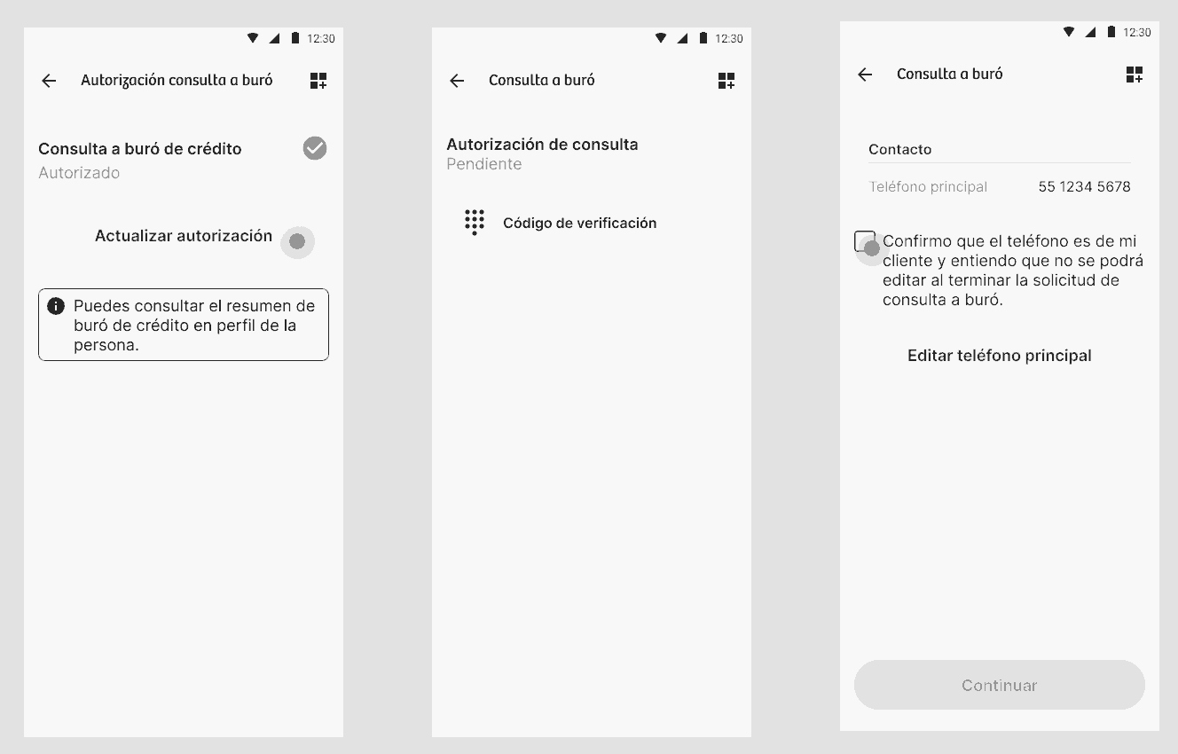
We found users sharing numbers that weren't theirs, which created friction later in collections. We're limiting the OTP to a single verified primary line per user.
From direct feedback by the support team, I decided to open the 60+ research line rather than wait for it to become a bigger problem. I also set the business rule limiting the OTP to one verified primary line per user.
Let's chat. I'm always open to understanding a project better, no matter how challenging or complex it seems.